
 By
ByModern website production is a conveyor belt that works around the clock and never stops. However, novice developers, like many clients who want to order website development, are faced with one popular question: how will the service be displayed on the screens of modern mobile devices?
Three potential answers appear at once: adaptive, optimized, and responsive types of designs. But what are they, how are they different, and is there a real difference between them? To understand this issue, you need to seek help from a BigCommerce web design company, whose specialists were able to give an answer that everyone could understand.
The mobile version of the website
Search algorithms are very friendly to mobile versions of various websites. It is the minimum set of tasks that must be completed for mobile users to have access to your resource.
Mobile versions are usually smaller copies of the desktop site. Developers sometimes limit the functionality, but this allows for a friendly interface, clear navigation, and increased loading speed. This is where we can see the distinction between the common desktop and mobile versions of the one website.
Responsive types of websites
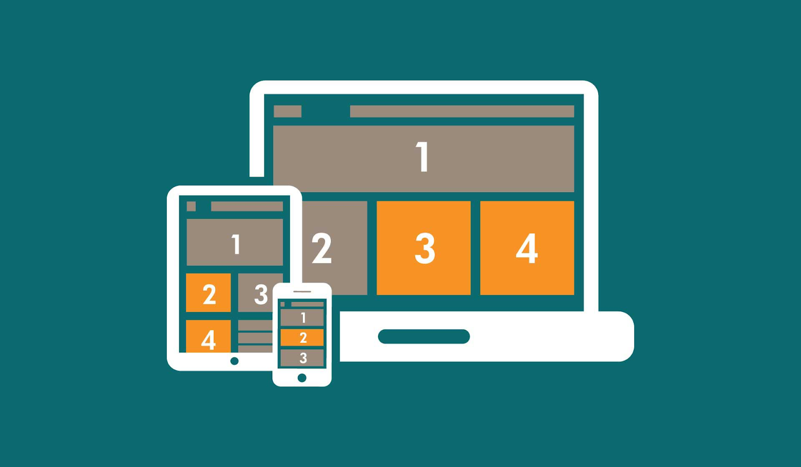
We are talking about sites with responsive types of design. Their peculiarity is that the design restructures the original web service for different gadgets. It does not matter what screen size the mobile gadget you are using has. This approach allows you to scale the site layout depending on what kind of device it is and what type of display it has. The service will be displayed equally well on a smartphone, laptop, tablet, or huge widescreen TV.
The critical advantage of responsive design is that it guarantees the convenience and flexibility of working with a site across all kinds of computers and mobile devices. It will always look as beautiful and convenient as possible.
Responsive type of websites
Adaptive type has its differences from mobile and particularly responsive versions. Not all web services are optimized for working with mobile gadgets, although this situation is gradually improving.
It is essential to understand that responsive design does not mean a shortened or cropped desktop version. This platform will have several display options directly related to the type of device and display width. In simple terms, the site will look the same on all smartphones but will differ from the tablet version. Checking for responsive design is quite simple. To do this, change the zoom settings in your browser. If changes occur in jerks rather than smoothly, you are on a service with a responsive design.
Why optimize websites for mobile?
In the modern world, this is more of a rhetorical question. The number of mobile gadget users is increasing every day. Millions of people perform their usual tasks no longer through a computer or laptop but thanks to portable tablets and modern smartphones.
Since mobile gadgets are compact and have small screen sizes compared to PCs, creating the convenient design is necessary. This way, users can quickly and efficiently find any answers to pressing questions. Therefore, most web services are now adapted to work on mobile screens.


